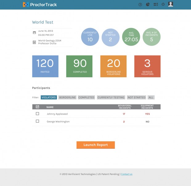
I had the pleasure of working on the redesign of a TechStars funded web application while I was in New York. Working closely with the art director at SCG Creative, we really hunkered down to how we could 1) make the web app super easy to use (most of the people would be using the application in isolation) and 2) tevitalizing the design. The application is made to help more effectively verify the identity of the people taking an online test (or other important document) with the end goal of given people who take online tests more credence for their hard work. It was a great exercise in re-thinking a user flow of an existing website to make the the processes as smooth as possible.
I worked on the design, wireframes, and iconography of the website.
I hope to post more details on the project soon, but for now I’ll uploads just some of the pages.
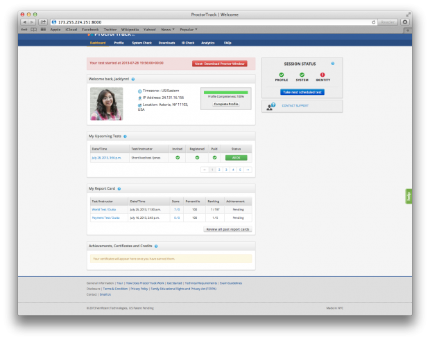
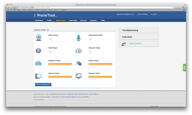
Previous design:
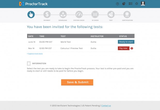
Start screen
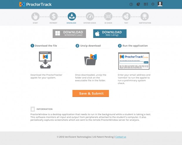
Download applet screen
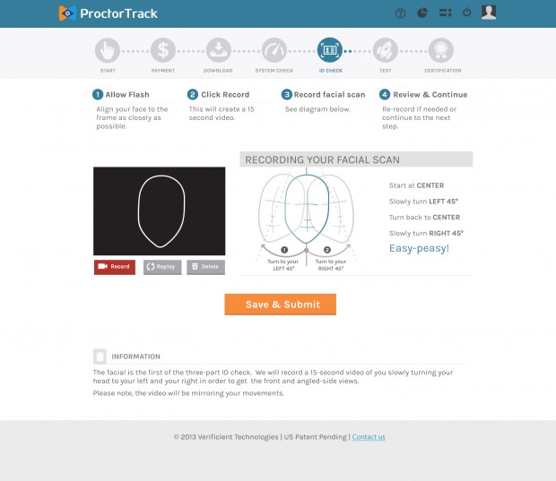
Face recognition/movement set up
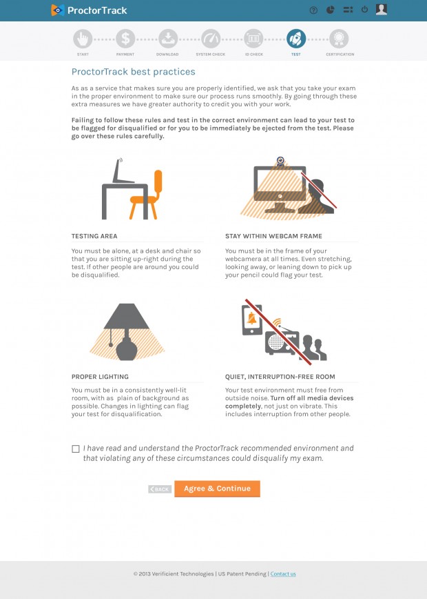
Best practices page
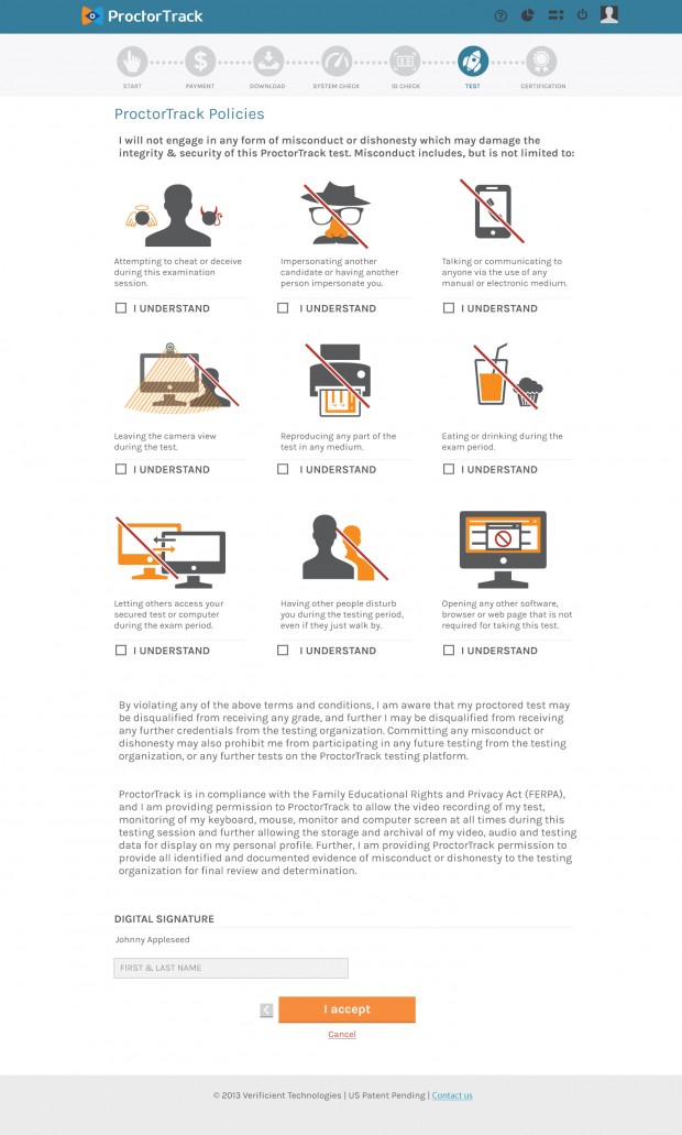
Policies page
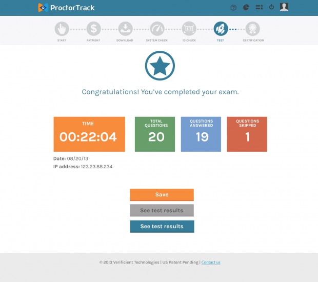
Test Results
One of the proctoring screens
