Hot sizzle! I was so thrilled to work with the West Career Academy recently to develop their branding. They are the partnering school for the Flobots.org‘s Youth Media Studio and so will be housed in the same space once it opens. Since I was so attached to this project through my work for YMS, I found it extremely challenging to convey everything I wanted—in the best way, of course.
Don’t be mislead by their dated website though, they plan expanding their program and developing their marketing swag. WCA aims to be more than just a school to help struggling kids graduate high school or get their GED, but to also sincerely re-engage them in learning and working towards a positive next stage of their life. Where they’ll be encouraged to express themselves artistically and discover their passions by faculty prepared to meet them where ever they are. Where their voice is heard and appreciated.
For the logo, we chose a bright staircase design to demonstrate the working up and towards a goal. The stair case is actually built from the three pieces of the “W,” which, to be honest, was actually a happy accident. The palette was developed from the orange, a nod to WCA’s sister school is West High whose colors are orange and black. This main image can be paired with a robot which the client really wanted to show their collaboration with Flobots.org.
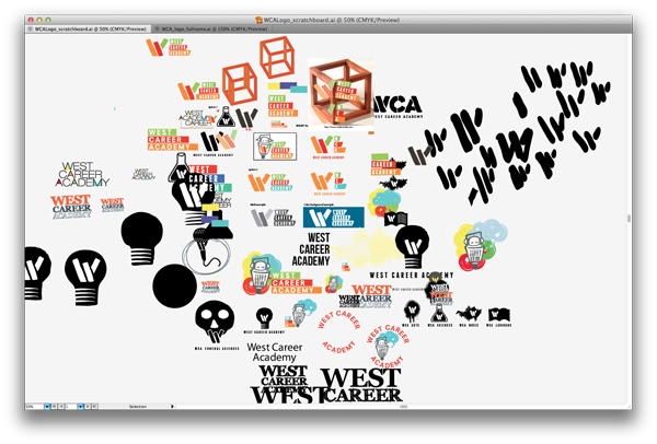
Here’s the screenshot from my art board. You can tell I was working with the “W” first. (please excuse the jokes to myself):
 My physical sketchbook is 80% incoherent, but maybe I’ll publish that too…one day.
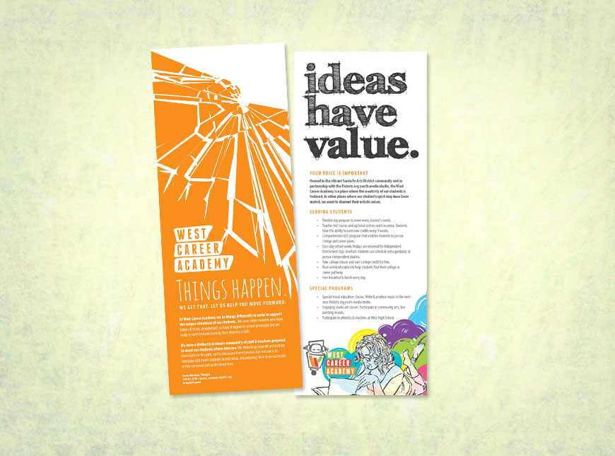
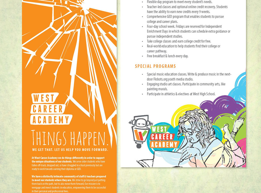
I also designed & wrote the content for their brochure (front & back). I was really happy to write the content in order to direct the feel of what I believe the school should say to its audience. Though I hope that this just the iceberg of their message, but they’re in a bit of a time crunch for now.


I am so grateful for Flobot.org referring me to them. It’s something that I care deeply about and feel so fortunate I was a part of it.

