I got a project to make an 80s-themed poster for Flobots.org à la Saved by the Bell. I thought it was going to be fun (and it was), but I also realized the 80’s were not a pretty time. In fact, it was completely at odds with all of my normal sensibilities as a designer.
INSPIRATION:

Does not exactly reflect my design education, right? Talk about trying something new!
It kind of looks like someone discovered how to make shapes in Microsoft Word and they never wanted to stop. Ever. Ever. After completing the one on the left, I created an second design because I just felt quite certain that we as a people have agreed to forget the 80’s ever happened. Don’t get me wrong, I thoroughly enjoyed the exploration into the black hole of design that is the 80’s and while I was constructing the pattern in the back, it gave me a vague nostalgia of my childhood clothes, but I just had an inkling that our memory of acid-washed jeans is prettier than perhaps it actually was.
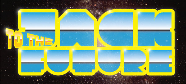
For example, I made this just for fun:

When all’s said and done, the Flobots.org decided to choose the black & colorful poster to the right for their marketing materials. I went with the other side of the 80s: The futuristic-layered-space-cowboy-and-glowing side. Except I reduced it a bit.
At this point, I really enjoy them both. Like lumpy-headed children. It was something different and who doesn’t love a good challenge?

